...
Today we wanted to provide you some screenshots of member manage to give you some idea of what the new interface will look like. You will notice some major changes to the Member Manager interface, the first being the lack of a ribbon. We have removed the ribbon navigation because it doesn't make sense to use it on a website. We have replaced it with several drop down buttons in the top navigation bar (in red). We have also moved the user add/edit/delete buttons below the navigation bar to ease in their use. The views are now available on the left in a list form and can be adjusted more easily. The main menu will be accessible by clicking the hamburger menu (3 dashes) in top left corner.
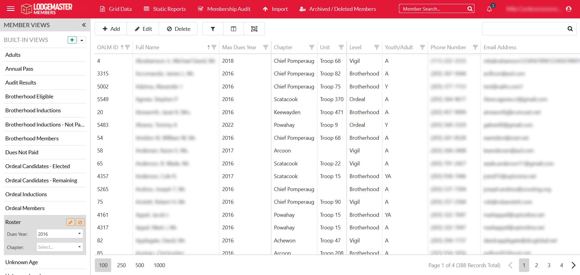
Member Module Grid
Please note: some of the columns are blurred out to protect personal information.
The second screenshot is of member editor, all of the sections themselves are very similar to the last version, but we've redesigned the interface to give you more room and make it easier to navigate. To do that we've changes from a window popup to a full page experience. The name appears at the top and important information that used to appear in the header, plus lots of new key information appear in a right menu. Links to easily copy id's and contact information, plus flags on missing or mad information, and an easy click button for dues all appear. The rest of the screen is a set of collapsible sections that contain everything that used to appear in the tabs.
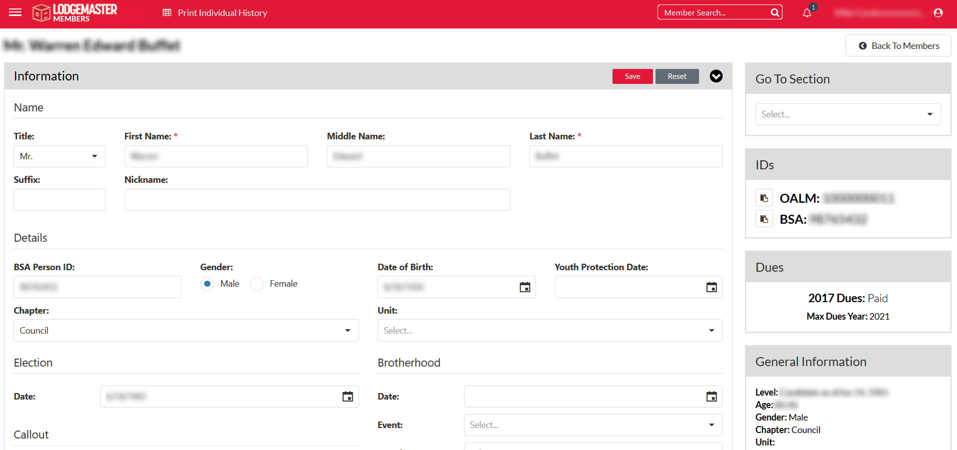
Member Editor
Please note: some of the columns are blurred out to protect personal information.
Lastly, attached is a screenshot of the reporting window. It will open in a new tab so you can continue working. Otherwise the parameters and controls are very similar to the current version.
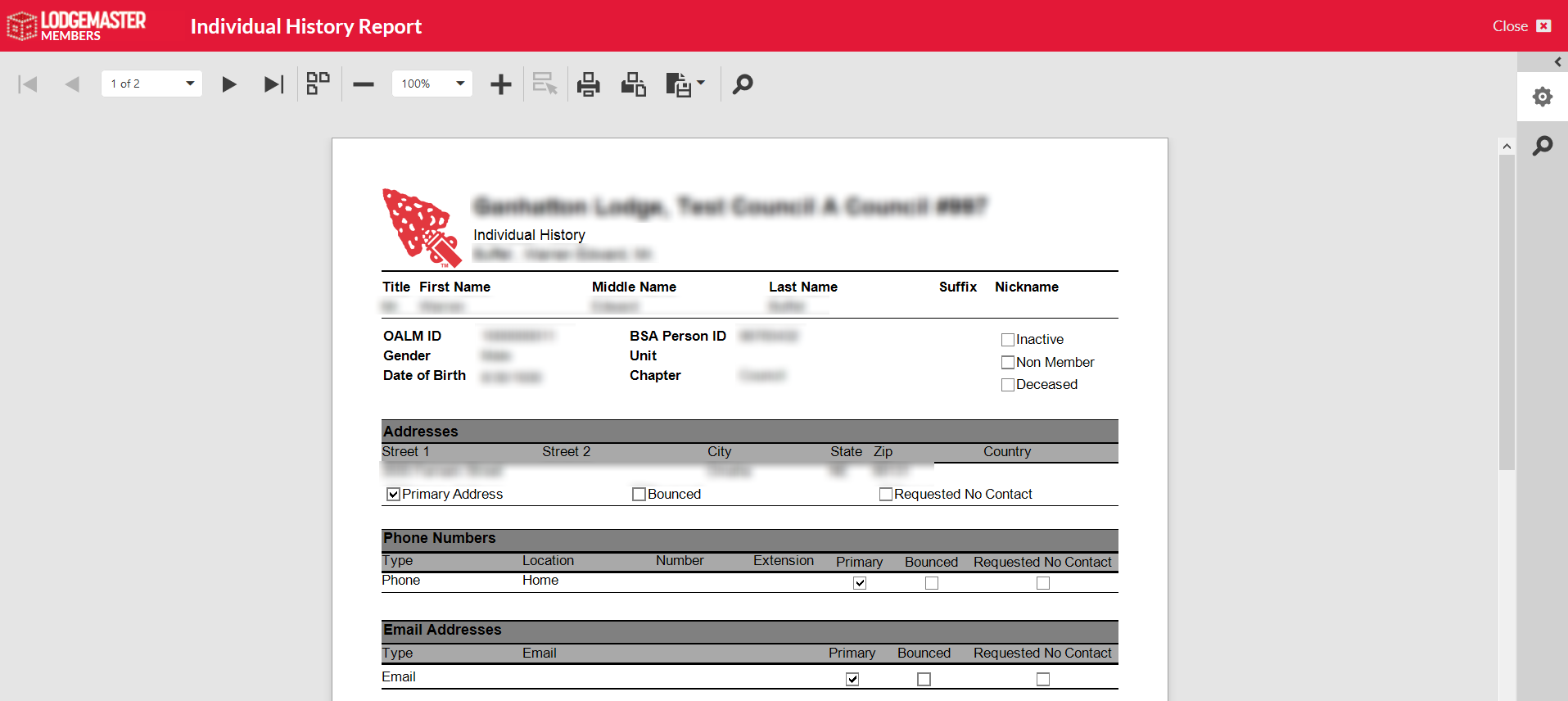
Reporting
Please note: some of the columns are blurred out to protect personal information.
...